정의 및 사용 방법
margin-bottom 속성은
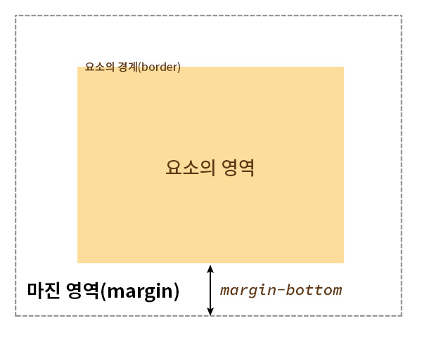
요소 아래쪽 경계(border)와 바깥쪽 사이의 여백 간격을 지정합니다.
이 속성을 사용하면 요소 아래쪽 경계와 요소의 바깥쪽의 빈 공간 높이를 설정할 수 있습니다.
요소의 경계와 바깥쪽 사이의 여백 간격을 마진 영역(margin area)이라고 말합니다.
즉, margin-bottom 속성은 마진 영역의 아래쪽 간격을 지정합니다.
기본 예제
다음의 CSS 라이브 데모로 margin-bottom 속성의 구현 방법을 확인해 보세요.
음수 값도 허용됩니다.
음수 값을 사용하면 양수 값의 반대 방향으로 간격을 설정하며, 인접한 아래쪽의 요소와 겹치게 할 수 있습니다.
형식 구문
selector {
    margin-bottom:  <길이> | <백분율(%)> | auto
}
구문
/* <길이> 단위 값 */
margin-bottom: 20px;
margin-bottom: 3em;
margin-bottom: -20px; /* 음수 값 허용 */
margin-bottom: -3em; /* 음수 값 허용 */

/* <백분율(%)> 단위 값 */
margin-bottom: 10%; /* 컨테이닝 블록 너비의 10% */
margin-bottom: 50%; /* 컨테이닝 블록 너비의 50% */
margin-bottom: -10%; /* 음수 값 허용 */
margin-bottom: -50%; /* 음수 값 허용 */

/* 키워드 값 */
margin-bottom: auto;

/* 글로벌 값 */
margin-bottom: inherit;
margin-bottom: initial;
margin-bottom: revert;
margin-bottom: revert-layer;
margin-bottom: unset;
값
margin-bottom 속성은 <길이> 단위 값, <백분율(%)> 단위 값, auto 값을 사용할 수 있습니다.
<길이> 단위 값
바깥 여백 간격 크기의 값입니다. (양수, 0, 음수가 가능합니다.)
상대적 <길이> 단위
절대적 <길이> 단위
-
px - CSS에서 사용 가능한 절대적 길이 단위
<백분율(%)> 단위 값
컨테이닝 블록(containing block)의 너비에 대한 백분율로 정의합니다. (양수, 0, 음수가 가능합니다.)
auto 값
브라우저가 적절한 바깥 여백 간격 크기을 설정합니다.
margin-bottom: auto는 일반적인 상황에서는 적용되지 않으며, 특정 레이아웃에서만 의미를 가집니다.
margin-bottom: auto가 의미를 가지는 경우
margin-bottom: auto 값이 적용되지 않는 요소에서는 margin-bottom: 0이 설정됩니다.
형식 정의
| 초깃값 | 0 |
|---|---|
| 적용 제외 요소 | 다음의 display 값 설정에서는 margin-bottom이 무시됨
<br>(레이아웃을 가지지 않으며, CSS 없이도 줄바꿈을 수행하는 기본 동작을 가짐)도 margin-bottom이 무시됨 |
| 상속 | 아니오 |
| 애니메이션 |
|
브라우저의 기본 스타일시트
margin-bottom 속성의 초깃값은 0입니다.
하지만, 브라우저의 기본 스타일시트에서 margin-bottom의 값이 별도로 설정되어 있는 요소들이 있습니다.
부연설명
각 브라우저는 HTML 요소에 대한 기본 스타일을 설정한 내장 스타일시트를 가지고 있습니다. '브라우저의 기본 스타일시트'(User Agent Stylesheet)라고 합니다. 이 스타일 시트는 웹 페이지의 기본 디자인을 정의합니다. 브라우저의 기본 스타일은 사용자 경험을 개선하기 위해 각 브라우저의 개발자가 설정한 것입니다. 여기에서 설정된 값들은 브라우저가 렌더링될 때 개발자에 의해 해당 속성의 값이 명시되지 않았을 때 적용되는 기본값입니다.
<h3>h3</h3>
<h4>h4</h4>
<h5>h5</h5>
<p>p</p>
<ul>
    <li>ul</li>
</ul>
<ol>
    <li>ol</li>
</ol>
<dl>
    <dt>dl</dt>
</dl>
<hr>
<figure>figure</figure>
<menu>
    <li>menu</li>
</menu>
<blockquote>blockquote</blockquote>h3
h4
h5
p
- ul
- ol
- dl
blockquote
예제
다음의 예제로 margin-bottom 속성의 사용 방법을 확인해 보세요.
기본 예제
<p>margin-bottom이 지정되지 않은 문단입니다.</p>
<p class="ex-1">margin-bottom이 50px인 문단입니다.</p>
<p>margin-bottom이 지정되지 않은 문단입니다.</p>.ex-1 {
margin-bottom: 50px;
color: red;
}margin-bottom이 지정되지 않은 문단입니다.
margin-bottom이 50px인 문단입니다.
margin-bottom이 지정되지 않은 문단입니다.
음수 값 예제
음수 값을 사용하면 양수 값의 반대 방향으로 간격을 설정하며, 인접한 아래쪽의 요소와 겹치게 할 수 있습니다.
<div class="box me">나</div>
<div class="box sibling">형제 요소</div>
.me {
    margin-bottom: -50px; /* 음수 값을 사용 */
    border: 3px dashed #663399;
    background: #ffd9f7;
}
.box {
    width: 200px;
    height: 150px;
}
.sibling {
    border: 3px dashed gray;
    background: rgba(0, 0, 0, 0.2);
}auto 값 예제
margin-bottom: auto는 플렉스 아이템이거나 그리드 아이템일 경우에 적용됩니다.
즉, 부모 요소의 display 값 설정이 flex나 inline-flex인 요소(플렉스 아이템)이거나, grid나 inline-grid인 요소(그리드 아이템)인 경우입니다.
<div class="box flex-box">
    <p>플렉스 아이템입니다. margin-bottom: auto가 적용됩니다.</p>
</div>
<div class="box grid-box">
    <p>그리드 아이템입니다. margin-bottom: auto가 적용됩니다.</p>
</div>.flex-box {
display: flex;
align-items: flex-end;
}
.grid-box {
display: grid;
align-items: end;
}
.box {
height: 120px;
background: gold;
}
.box + .box {
margin-top: 1em;
}
p {
background: yellowgreen;
margin-top: 0;
margin-bottom: auto; /* 플렉스 아이템 또는,
그리드 아이템일 경우에만 적용됨 */
}margin-bottom: auto가 적용되는 요소는 요소 아래쪽 경계와 요소의 바깥쪽 사이의 빈 여백 공간 높이를 최대한으로 설정합니다.
플렉스 아이템입니다. margin-bottom: auto가 적용됩니다.
그리드 아이템입니다. margin-bottom: auto가 적용됩니다.
마진 상쇄(margin collapsing)
CSS에서 인접한 요소의 마진 영역(margin area)은 특정 레이아웃에서 서로 겹칠 수 있습니다. 이때 서로 맞닿으면 그 중 큰 값으로 결합해서 작은 값은 상쇄(collapsing)됩니다. 이를 '마진 상쇄(margin collapsing)'라고 합니다.
'마진 상쇄(margin collapsing)'의 규칙입니다.
- 양수 값과 양수 값이 맞닿으면 그 중 가장 큰 값으로 결합니다. 작은 값은 상쇄됩니다.
- 양수 값과 음수 값이 맞닿으면 두 값을 더한 나머지 값으로 상쇄됩니다.
- 음수 값과 음수 값이 맞닿으면 그 중 가장 작은 값으로 결합니다. 큰 값은 상쇄됩니다.
- 플렉스 아이템이거나 그리드 아이템일 경우에는 '마진 상쇄(margin collapsing)'가 발생하지 않습니다.
position이absolute나fixed로 설정된 경우에는 '마진 상쇄(margin collapsing)'가 발생하지 않습니다.float이 설정된 경우에는 '마진 상쇄(margin collapsing)'가 발생하지 않습니다.
인접 형제의 margin-top과 margin-bottom의 상쇄(collapsing)
인접하는 요소끼리 margin-top과 margin-bottom이 서로 맞닿으면 그 중 큰 값으로 결합해서 작은 값은 상쇄(collapsing)됩니다.
다음의 예제는 양수 값과 양수 값이 맞닿으면 그 중 가장 큰 값으로 결합하는 예제입니다. 작은 값은 상쇄됩니다.
<div class="box box-1">box-1</div>
<div class="box box-2">box-2</div>.box {
width: 100px;
height: 100px;
background: orange;
}
.box-1 {
margin-bottom: 50px;
}
.box-2 {
margin-top: 100px;
}실제 적용된 모습을 통해 알 수 있듯이, 인접하는 요소끼리 margin-top과 margin-bottom이 서로 맞닿으면 그 중 큰 값으로 결합해서 작은 값은 상쇄(collapsing)됩니다.
.box-1의 margin-bottom: 50px과 .box-2의 margin-top: 100px이 맞닿으면 50px + 100px = 150px의 여백 간격이 설정되는 것이 아니라 두 값 중에서 큰 값인 100px의 여백 간격이 설정되는 것을 볼 수 있습니다.
부모-자식 간 margin-bottom과 margin-bottom의 상쇄(collapsing)
부모 요소의 padding-bottom이나 border-bottom이 없을 때, 부모 요소의 아래쪽 경계에 자식 요소가 맞닿을 경우에 margin-bottom이 부모 요소의 바깥으로 빠져나갑니다.
이때, 부모 요소에 margin-bottom이 설정되어 있으면 부모 요소와 자식 요소의 '마진 상쇄(margin collapsing)'가 발생합니다.
<p>부모 요소에 padding-bottom이나 border-bottom이 없을 때</p>
<div class="parent parent-1">
    <div class="child">child</div>
</div>
<p>부모 요소에 padding-bottom이나 border-bottom이 있을 때</p>
<div class="parent parent-2">
    <div class="child">child</div>
</div>.parent-1 {
margin-bottom: 30px; /* 부모 요소와 자식 요소의 '마진 상쇄(margin collapsing)'가 발생합니다. */
}
.parent-2 {
border-bottom: 2px solid red;
}
.parent {
background: silver;
height: auto;
}
.child {
width: 100px;
height: 100px;
background: gold;
margin-bottom: 50px;
}부모 요소에 padding-bottom이나 border-bottom이 없을 때
부모 요소에 padding-bottom이나 border-bottom이 있을 때
브라우저 호환성
| 속성 |
데스크탑 Chrome

|
데스크탑 Edge

|
데스크탑 Firefox

|
Safari

|
|---|---|---|---|---|
margin-bottom
|
1 | 12 | 1 | 1 |
엣지(Microsoft Edge) 브라우저의 경우 쿼크 모드(Quirks Mode)에서 margin-bottom: auto를 지원하지 않습니다.
명세서
| 명세서 사양 | |
|---|---|
margin-bottom
|
CSS Box Model Module Level 3 #margin-physical |