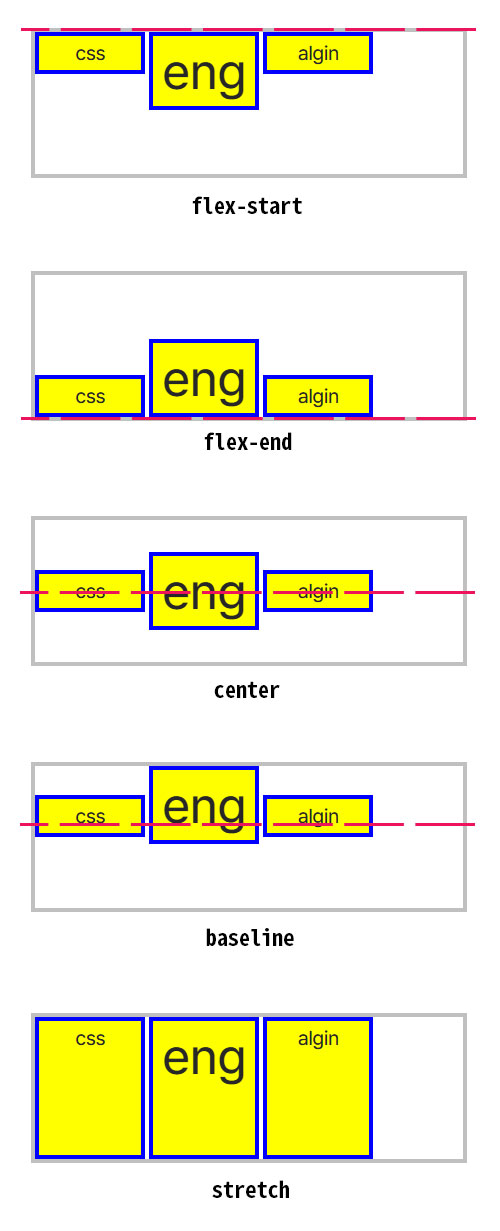
flex-start |
플렉스 아이템들은 플렉스 컨테이너 교차축의 시작 쪽을 기준으로 정렬됩니다. |
|---|---|
flex-end |
플렉스 아이템들은 플렉스 컨테이너 교차축의 끝 쪽을 기준으로 정렬됩니다. |
center |
플렉스 아이템들은 플렉스 컨테이너 교차축의 시작과 끝 쪽의 가운데를 기준으로 정렬됩니다. |
baseline |
플렉스 아이템들은 플렉스 컨테이너 교차축의 baseline을 기준으로 맞춰 정렬됩니다.
플렉스 아이템들에 대한 요소 박스 기반의 정렬이 아니라, 내부 텍스트의 baseline을 기준으로 정렬됩니다. baseline이란 글자의 "기준선"이라고도 말하며, 영어의 소문자에서 g,j, q 등과 같이 글자 하단 밑의 아래까지 표시되는 글자와 그렇지 않는 경계의 "기준이 되는 선"을 의미합니다. 한글을 비롯하여 동남아의 글자에는 baseline 밑의 아래까지 표시되는 글자가 없습니다.
만약 플렉스 아이템 내부에 텍스트가 없거나, 교차축에 맞는 baseline이 없는 경우에는 플렉스 아이템의 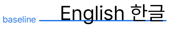
border-box(테두리 박스)의 교착축 시작 쪽이 baseline으로 대신 사용됩니다. |
stretch |
초깃값임.
플렉스 아이템들은 플렉스 컨테이너 교차축 방향으로 여유 공간이 있으면 채우도록 늘어납니다. 이때, 교차축 방향에 대한 플렉스 아이템의 크기에 대한 제약 조건이 있으면, 제약 조건을 준수합니다. 플렉스 아이템의 크기에 대한 제약 조건은 다음과 같습니다.
|
| 속성 |
데스크탑 Chrome

|
데스크탑 Edge

|
데스크탑 Firefox

|
Safari

|
|---|---|---|---|---|
align-items
|
29 | 12 | 20 | 9 |
| Flex 레이아웃에서 지원됨 | 52 | 12 | 20 | 9 |