정의 및 사용 방법
flexbox에서 justify-content 속성은 플렉스 컨테이너에서 플렉스 아이템이 배치되는 주축(main axis)을 기준으로 아이템들을 어떻게 정렬할지를 지정합니다.
알아두세요!
justify-content 속성은 flexbox, grid 레이아웃에서 공통으로 사용할 수 있습니다.
이 글에서는 flexbox에서의 justify-content 속성만 설명합니다.
이때, flex-direction 속성은 플렉스 아이템이 배치되는 흐름의 기준이 되는 주축(main axis, 기본 축)을 결정합니다.
justify-content 속성은 이 주축을 따라 플렉스 아이템들을 어떻게 정렬할지 지정하며, 정렬 방식에 따라 발생하는 플렉스 컨테이너와 플렉스 아이템 간의 남는 여유 공간은 자동으로 분배됩니다.
기본 예제
플렉스 아이템이 배치되는 흐름의 기준이 되는 주축(main axis, 기본 축)의 정렬 방식을 지정할 수 있습니다.
<div class="flex-container">
    <div class="item">1</div>
    <div class="item">2</div>
    <div class="item">3</div>
    <div class="item">4</div>
</div>.flex-container { /* 플렉스 컨테이너 */
display: flex;
border: 4px solid silver;
flex-direction: row; /* 주축(main axis, 기본 축)을 결정 */
justify-content: /* value <= 라이브 데모에서 동적으로 구현 */
}
.item { /* 플렉스 아이템 */
border: 4px solid blue;
background-color: yellow;
}
/*
* 일부 스타일 코드는 가독성을 위해 생략했습니다!
*/특징
형식 구문
selector {
    justify-content: flex-start | flex-end | center | space-between | space-around
}
이 형식 구문(Formal syntax)은 CSS Flexible Box Layout Module Level 1 명세서를 기준으로 작성되었습니다.
justify-content 속성은 flexbox뿐만 아니라 grid 레이아웃에서도 사용되며, 전체 정렬 구문은 CSS Box Alignment Module Level 3 명세서를 참고하세요.
구문
/* 키워드 값 */
justify-content: flex-start; /* 초깃값 */
justify-content: flex-end;
justify-content: center;
justify-content: space-between;
justify-content: space-around;

/* 글로벌 값 */
justify-content: inherit;
justify-content: initial;
justify-content: revert;
justify-content: revert-layer;
justify-content: unset;
값
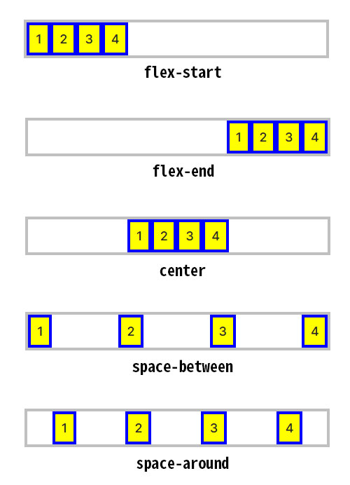
flex-start |
초깃값임.
플렉스 아이템들은 원래의 순서를 유지한 상태로 플렉스 컨테이너 주축의 시작 쪽을 기준으로 밀착하여 정렬됩니다. |
|---|---|
flex-end |
플렉스 아이템들은 원래의 순서를 유지한 상태로 플렉스 컨테이너 주축의 끝 쪽을 기준으로 밀착하여 정렬됩니다. |
center |
플렉스 아이템들은 원래의 순서를 유지한 상태로 플렉스 컨테이너 주축의 시작과 끝 쪽의 가운데를 기준으로 밀착하여 정렬됩니다. |
space-between |
플렉스 아이템들은 원래의 순서를 유지한 상태로 플렉스 컨테이너 주축이 되는 라인을 따라 배치되며, 각 아이템들 사이에 동일한 여유 공간이 생기도록 정렬됩니다.
|
space-around |
플렉스 아이템들은 원래의 순서를 유지한 상태로 플렉스 컨테이너의 주축이 되는 라인을 따라 시작 쪽과 끝 쪽 모두 동일한 간격을 유지하며 배치됩니다.
|
flex-direction: column과 justify-content
flex-direction 속성의 값이 column일 경우 justify-content 속성에 대한 값과 그 효과가 어떻게 달라지는지 라이브 데모로 확인해 보세요.
<div class="flex-container">
    <div class="item">1</div>
    <div class="item">2</div>
    <div class="item">3</div>
    <div class="item">4</div>
</div>.flex-container {
display: flex; /* 플렉스 컨테이너 생성 */
border: 4px solid silver;
flex-direction: column; /* 주축(main axis, 기본 축)을 결정 */
justify-content: /* value <= 라이브 데모에서 동적으로 구현 */
}
.item { /* 플렉스 아이템 */
border: 4px solid blue;
background-color: yellow;
}
/*
* 일부 스타일 코드는 가독성을 위해 생략했습니다!
*/flex-direction: column과 justify-content
데모 버튼을 클릭해 보세요!
형식 정의
| 초깃값 | flex-start |
|---|---|
| 적용 요소 | 플렉스 컨테이너 |
| 상속 | 아니오 |
| 애니메이션 | 아니오 |
활용 예제
justify-content 속성은 실무에서 특정 박스의 콘텐츠 레이아웃을 설정하는 데 정말 많이 사용됩니다.
아래는 그중에서도 가장 대표적이라고 할 수 있는 '내비게이션 바 메뉴의 가로 가운데 정렬'과 '사이트 헤더 레이아웃에서 가로 양쪽 정렬'에 대한 활용 예제입니다.
내비게이션 바 메뉴의 가로 가운데 정렬
<nav>
    <ul>
        <li><a href="">제품 보기</a></li>
        <li><a href="">개인정보처리방침</a></li>
        <li><a href="">고객센터</a></li>
    </ul>
</nav>
코드 부연설명
<nav> 태그는 다른 웹 페이지로 연결하거나, 현재 웹 페이지의 콘텐츠 내부로 연결되는 탐색(navigation)을 위한 링크(links)가 있는 영역을 나타냅니다. 일반적인 예로는 메뉴, 목차, 색인 등이 있습니다.
ul {
    display: flex;
    justify-content: center;
    margin: 0;
    padding: 1em;
    background-color: #e3f2fd;
}
li {
    list-style: none;
}
a {
    color: inherit;
    text-decoration: none;
}
a:hover {
    text-decoration: underline;
}
li:not(:first-child)::before {
    content: "";
    display: inline-block;
    width: 1px;
    height: 0.8em;
    background-color: rgba(0, 0, 0, .6);
    margin: 0 1em;
    vertical-align: -0.06em;
    white-space: nowrap;
}사이트 헤더 레이아웃에서 가로 양쪽 정렬
<header class="site-header">
    <div class="logo">
        <a href="">Your Logo</a>
    </div>
    <div class="user-actions">
        <a href="">로그인</a>
        <a href="" class="btn-signup">회원가입</a>
    </div>
</header>.site-header {
display: flex;
justify-content: space-between; /* 로고와 사용자 액션 버튼을 양쪽 끝으로 배치 */
align-items: center; /* 세로 축의 중앙에 배치하여 수직 정렬을 맞춤 */
padding: 1em 2em;
background-color: #e3f2fd;
}
.logo a {
font-weight: bold;
color: #1976d2;
text-decoration: none;
}
.user-actions a {
margin-left: 1.5em;
color: #666;
text-decoration: none;
font-size: 0.9em;
}
.user-actions .btn-signup {
padding: 0.5em 1em;
background-color: #1976d2;
color: #fff;
border-radius: 4px;
}코드 부연설명
flexbox에서 align-items 속성은 플렉스 아이템이 배치되는 주축과 수직으로 교차되는 방향 축(cross axis)을 따라 플렉스 아이템을 어떻게 정렬할지 결정합니다. align-items: center는 교차되는 방향 축(cross axis)의 가운데에 플렉스 아이템을 배치합니다.
브라우저 호환성
| 속성 |
데스크탑 Chrome

|
데스크탑 Edge

|
데스크탑 Firefox

|
Safari

|
|---|---|---|---|---|
justify-content
|
29 | 12 | 20 | 9 |
| Flex 레이아웃에서 지원됨 | 52 | 12 | 20 | 9 |
명세서
| 명세서 사양 | |
|---|---|
justify-content
|
CSS Flexible Box Layout Module Level 1 #justify-content-property |
같이 보기
- CSS flex-direction 속성 – 플렉스 아이템이 배치되는 흐름 방향 지정
- CSS flex-wrap 속성 – 플렉스 컨테이너의 줄바꿈 허용 설정
- CSS flexbox의 align-items 속성
- CSS flexbox의 align-content 속성
- CSS flex-flow 속성 – flex-direction과 flex-wrap의 단축 속성
- CSS flexbox의 gap 속성
- CSS 플렉스 컨테이너(Flex Container)
- CSS 플렉스 아이템(Flex Item)
- CSS text-align 속성 – 텍스트 등 인라인 콘텐츠 가로 정렬 설정